-


Swedish Pavilion - Shangai Expo
Designing the Swedish Pavilion at the 2010 Shanghai Expo was a slightly less daunting task than designing many of the other pavilions, because it had a clearly defined function. What makes these projects so difficult in general is the almost entirely open-ended nature of the brief – they have to convey something about the national character, and house an exhibition, but beyond that and the physical limitations of the site, it is possible to do anything. In the case of the Swedish Pavilion, however, there was at least a requirement to house meetings with potential trade partners, and this gave the design more of a functional programme than is customary.
Images courtesy of August Wiklund, Sweco, & Petter EldinArchitect Sweco (Johannes Tüll) Location Shangai - China Company involved SSAB Website http://www.ssab.com
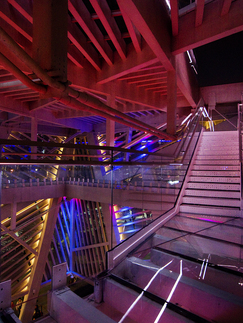
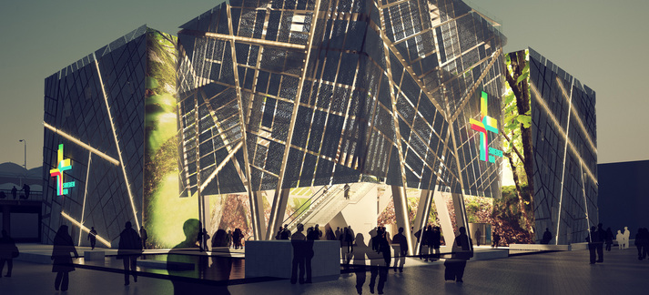
The solution, on a relatively small site of only 3,000m2, was a square building, made up from four smaller squares which were linked by glazed bridges. One was an entrance pavilion, going to the full height of 20m. This was partly for dramatic effect, but also because it was the only part of the project on which the architects at Sweco, who designed the building, managed to use glulam (glued laminated timber). ‘It is a material that is typical of Sweden,’ explained Christer Stenmark, one of the lead architects, ‘but we were not allowed to use timber in China’. At last the team prevailed to some extent, but was only allowed to make the timber element one storey high – hence the single-storey entrance. There was a high-level balcony bar, with views out and a deliberately scary glass floor.
The other three parts of the building, which were on three floors and included a Swedish kitchen, were steel-framed. The most interesting part of this building was its cladding. The whole of the exterior is covered in a smooth white skin, perforated in lines in what seems at first a slightly random fashion, but in fact is a representation of part of the street plan of Stockholm, Sweden’s capital city. The perforation was carried out in China, but the steel itself came from Swedish company SSAB, as it was a special steel with environmental properties.
Called Prelaq Energy, it reflects solar radiation, while still allowing heat that builds up within the building to escape. In this way, it reduces the need for cooling, and it played a vital role in the environmental strategy for the pavilion. The same material was also used on the roof, in a yellow colour – since the pavilion was near to taller structures, it was important that it looked good from above.
Making the cladding was complicated. ‘Each plate was different from all the others,’ explained Stenmark. ‘There were many hundreds of different plates. It was hard to get the Chinese quality – it’s not like Swedish quality.’
The ‘internal’ walls – that is, the inward facing walls of the four pods – had a very different treatment. The overall concept of the pavilion was based on a meeting between the city, man and nature. Man was represented by the visitors to the pavilion. The city was on the outside, and on the inside was nature, in the form of hanging printed textiles with giant photographs of Swedish forests taken by Mattias Klum. Whereas one could often imagine a city standing surrounded by forest, here the forest is concealed within the city.
The perforations of the external walls were visible from inside, and the building also had perforated metal ceilings, to extend the feeling of lightness and of pattern. The pavilion was designed to be demountable and re-usable, another important part of the sustainability strategy.
Amongst the 70 million visitors to the Shanghai Expo, 3.5 million came to the Swedish pavilion. It was by no means the most visited pavilion, but the focus had been not on numbers but on quality. Those visitors who did come, and particularly those who attended meetings, found themselves in a comfortable, environmentally friendly space which had been designed with great competence and imagination – a good advertisement for the country that it represented.
Images courtesy of August Wiklund, Sweco, & Petter Eldin


